An interaction designer plans and designs the visual and logical interactions on a digital interface so that people can communicate with a system and the system can respond logically.
When we design an interaction, how do we plan it? We have a map of what the customer wants to do, what they already know at the specific stage of an interaction, what they want to see, how we anticipate that they might select, tap, click, move, or use show and hide options. Sometimes customers see something new, a new possibility in their journey and they decide new types of interactions in the moment.
In all cases, interactions facilitate customers’ actions and decisions which means that we design interactions to respond to the hierarchy of information that is relevant to the customers.
Interaction design punctuates the milestones in the customers’ hierarchy of content needs in their moment of decisions.
“Interaction Design is the creation of a dialogue between a person and a product, system, or service. This dialogue is both physical and emotional in nature and is manifested in the interplay between form, function, and technology as experienced over time.”—John Kolko, Author of Thoughts on Interaction Design (2011)
The interaction designers:
- Know what the customers’ goals are, and what they expect to see or know as a result of an interaction
- Understand the information that they customers might be looking for; and possibly in what order, or in what possible combinations of sequences. For example applying filters in a list of orders is an optional interaction and they can use the filter at step 2 or 3 or 4 during a set of interactions in the list.
- Plan an interaction that might advise the customer A and at the same time, helps the customer B who are already sure of what they want to do
- Have the research findings that guides them for the customers’ interaction behavior and patterns for their specific strengths and constraints. It could be dealing with the customers’ curse of knowledge, or complying with their special needs for accessibillity, or a category-specific disorder such as in mental health.
This is why content hierarchy is important where we design the content for the expected sequence of customers’ consumption of information. And then we design the corresponding interactions as the customer’s intent, needs, and goals unfold at each stage of their interaction.
Example: Coinbase onboarding design
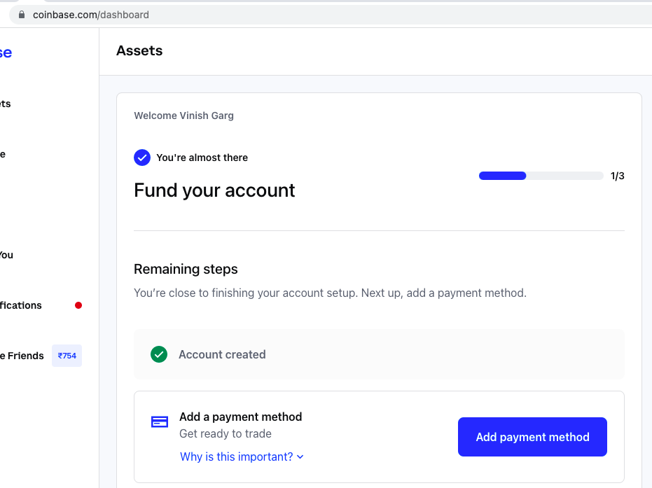
Let’s see the Coinbase onboarding as an example. This page shows a well-designed content hierarchy that is clear, and it gives the confidence to the users to continue with their onboarding.

You are almost there
When you login for the first step after creating an account, Coinbase welcomes you to your account. The heading says—You’re almost there. It gives you assurance that you have taken the first step correctly.
Fund your account
The design of this message shows that it is an important step if you want to use Coinbase for the real purpose for which you had signed up. It advises you that you should fund your account, and that you have completed one of the three steps.
Remaining steps
The message shows that the next step is to add the payment method. In Why is this important, It gives me an option to educate myself for why this step is important.
Visual hierarchy
In the Coinbase example, see how the visual hierarchy maps the content hierarchy. For example, the green color check mark for Account created, and the subtle use of colors and font size variations are an example of intelligent interaction design that contributes to the well-designed content hierarchy.
Visual hierarchy adds the right context to the interaction design, for readability, scan-ability, and reference-ability which means giving more confidence to the users. You cannot plan the visual hierarchy for text size, colors, white space, proximity-ratio, and container-ratio to set up visual layout if you do not know the content hierarchy for how the audience reads the content and makes decisions.
Example: Stripe interactions design
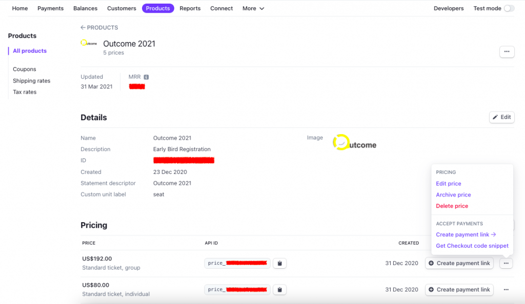
Stripe is another example of beautifully designed interactions for the customers’ hierarchy of content needs on the interface.

Interaction design responds to the content hierarchy goals
As content or design practitioners, we focus on user research and findings for design, design and content systems, terminology management and microcopy. So much of product success lies in the common sense attention to details for small and subtle variations in the content for its placement, font size, container-ratio, and color scheme. It sets up the right speed in the reading experience of the audience.
Content hierarchy is not only about prioritizing the content for its importance for the customers’ needs and goals. It is also about the context and then sizing the content for volume, frequency, its timing, and such factors that determine the information consumption patterns. Modern interface design is not simple anymore as I shared the Stripe example earlier in this post. We see that the interface are being designed on top of the content types.
The goal of content hierarchy is to help the customers know that they can serve themselves confidently. Interaction design that matches with this content hierarchy design serves the customers well, and for longer period of time.
—
This topic is part of my advanced course in product content strategy, content design, and UX Writing. See the course details for how we can find and add more meaning to our work.
