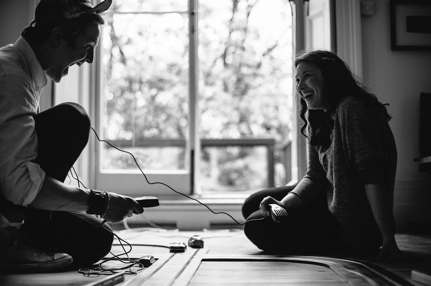
The product teams design happiness for the users—and for their communities.
One of my tweets on poor UX triggered this post. I often see instances of a poor UX — whether for the way a button or tab responds rather than what it promises, or for the way it makes me take the next action.
In the absence of a goal-oriented contextual experience, sometimes I interact with the product as if I am prepared for—“It is fine if it does not work this time, I am prepared to try again.”
Just think what the user may be trying to do:
- Contact someone (a parent to share a news, a lead for conversion, a doctor for medical help)
- Make a transaction (paying school fee for your kid on the last day, buying a gift for someone, paying an online bill)
- Save a relationship (sharing an apology note, booking an online ticket to travel)
- Make a difference (donating for a non-profit, fixing a prototype on a shared whiteboard, signing a petition)
- Win a new contract
Look at the stakes. Just think—there are people involved.
And if someone sitting close to this user asks for something (pass the sauce bottle?), it is taken as a distraction because the user is unhappy for something else—in the UX. Whether the sauce bottle is passed or not, this annoyance travels to others—whether at home, at work, or anywhere. So it was not about a button with inaccurate CTA (Call To Action), it is much bigger and is an open button.
Now consider the same scenario when users interact with the product with a positive frame of mind (based on past experiences in general), and they find the product responding well to their actions, for desired outcomes. A voice by someone around seems like a sound and not a noise, and is not a distraction. It just changes the whole picture for those around—and it fosters harmony.
Isn’t it so great to have the power to do that—to make such an impact in others’ lives?
Although the user could see the expected outcome in earlier case too (with friction) but there was annoyance around. Unnecessarily.
People who are not using the product deserve more positive energy around them.
A more channelized effort in the UX design has the power to bring shared joy and a harmony in the users’ lives—to their contacts and extended community.
- It is not about the page or screen or confirmation message—it is about what can actually delight the users. Remember that this joy spreads to people around the users. The product team culture should empower everyone to work towards such customer delight goals.
- A product interaction is a promise because there is an anticipation, a journey, and an outcome. The big picture experience is the sum total of small promises at interface level—and we should fulfill these promises.
- For all annoyance in our life, we blame others—government (for tax policies), neighbors (for littering), or friends (for their body odor). We are not accountable for designing broken UX promises—It means that we are even more powerful to design ‘make a difference’ like experiences.
It is a win-win for all.

PS: A quick reference (for specific use cases and not a long list of best readings in UX practices and trends) that I often use is:
- The Most Important Rule in UX Design that Everyone Breaks
- Design better forms, Designing Great UX for Sign Up Form
- The Interface Content
- Towards a new information architecture
Photo credits: By Paul Bence on Unsplash
